Instant Payment System
Client
BTS Digital
Coworker
Svetlana Gorshkova
Industry
Fintech
Creative direction
Brand Design
UX/UI Design
Communication Design
Services
2025
Year
IPS is an innovative instant payments and transfers platform enabling users to send and receive non-cash transfers instantly via mobile phone number, QR-code, or account details directly within their banking apps. The service is built on modern infrastructure that ensures instant crediting, low fees, seamless integration, and a frictionless user experience—making financial transactions faster, more convenient, and secure than ever before.
Problem
The main task was the development of all visual and digital materials for IPS, a new instant money transfer service integrated directly into partner banks’ apps. From creating the brand identity and crafting the UI/UX for the website to designing supporting collaterals, we needed to deliver a cohesive system that introduces and strengthens this service’s presence across multiple touchpoints—requiring us to align design strategy with technical constraints and ecosystem integration .
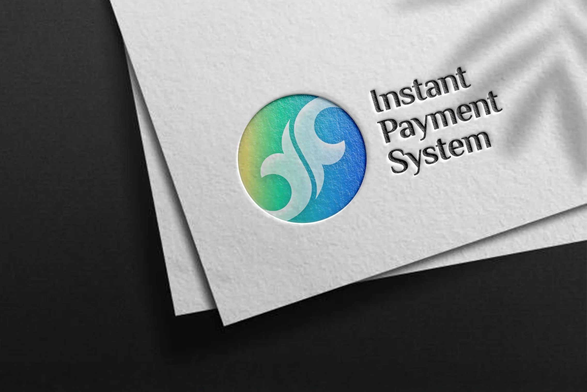
Logo

Symbolism
We selected a circular shape and colors merging the globe and a coin to symbolize both monetary value and global reach—the round shape evokes trust, unity, and continuity, while the coin motif immediately conveys financial transactions; integrating the Earth reinforces seamless connectivity in instant payments. The main colors are blue, green and yellow. Blue symbolizes reliability, stability, and professionalism: common in financial, tech, and corporate branding. It also reflects a connection to Aitu’s parent ecosystem.
In Kazakh (көк), blue is linked to the boundless sky, wisdom, purity of spirit, and loyalty.
Green in a financial context represents growth, money, and success.
In Kazakh (жасыл), green traditionally signifies nature, renewal, vitality, and well‑being.
Yellow embodies energy, positivity, and wealth. In design, it is often associated with warmth and accessibility.
In Kazakh (күн), yellow is connected to the sun, warmth, and prosperity: it represents grandeur and success, especially evoking gold (алтын).
The typeface used for the text portion of the logo echoes the contours and letterforms of the “Kazmoyin” symbol and pattern that form its foundation. In addition to supporting Russian and English, the font includes complete coverage of Kazakh language characters, eliminating any potential display issues.
“Kazmoyin” pattern means Harmony & Movement – the smooth lines evoke energy flows and continuous motion. Two symmetrical elements symbolyze two mutually directed money transfers.

Distinctive identity infused with meaning and powerful symbols

Application interface

Brandbook


Brandbook pages

Business cards

IPS in the application of bank
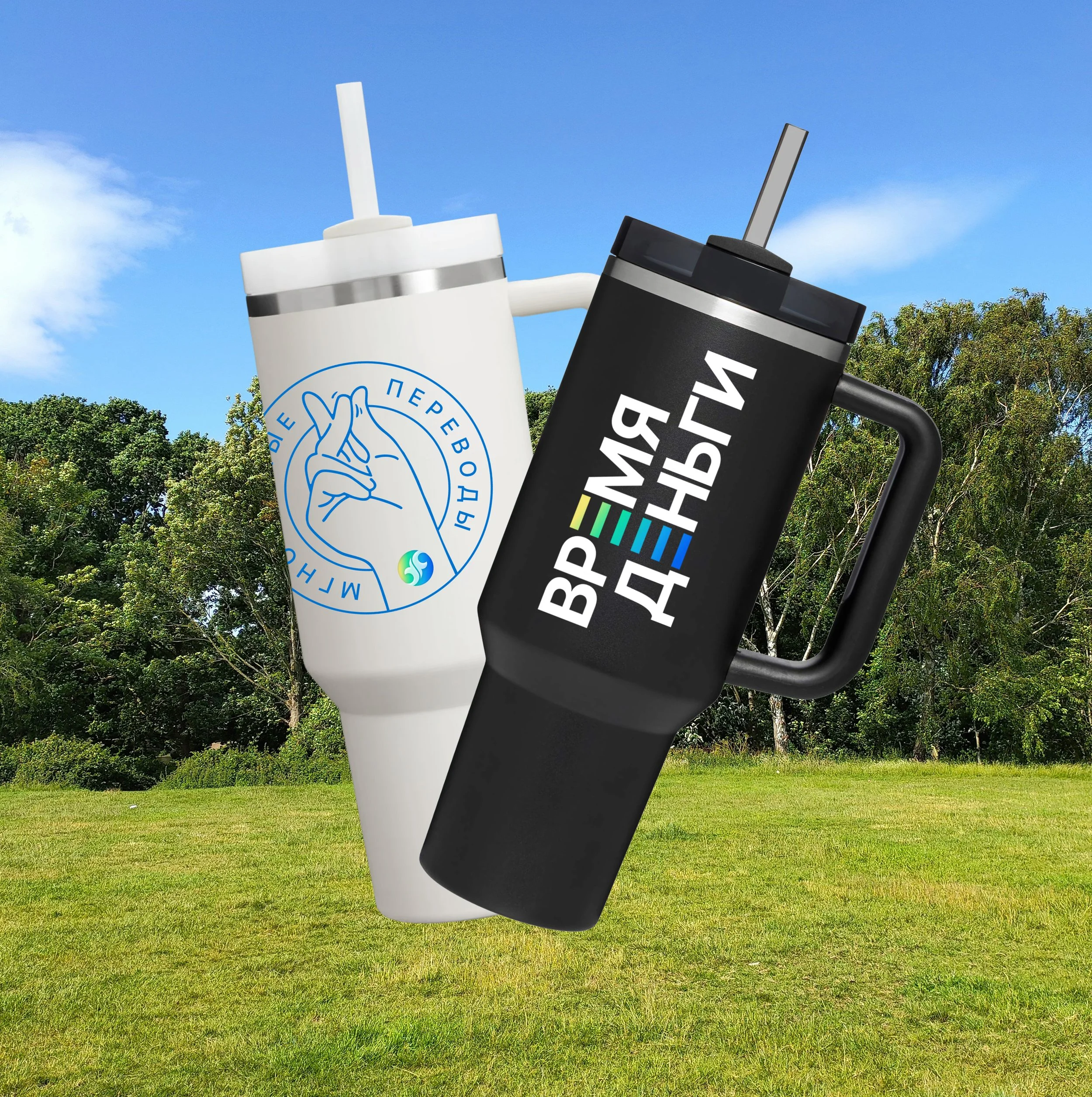
Thermo mugs
Process
Our work on IPS began by benchmarking against leading international FinTech brands to capture the visual language of confidence and innovation then infusing it with a distinctive fresh energy and vibrant color palette unique to the service. The logo underwent an intensive creative phase — over 50 versions — until a final version rich in layered symbolism and intentional color usage was selected through a rigorous filtering process and validated via focus group testing among the target audience. This bespoke identity was then documented in a detailed brand book and style guide, covering everything from advertising assets to partner platform integration. As the scope grew at the client’s request, the guides expanded to become comprehensive toolkits empowering both internal product designers and external collaborators. Next, we designed and launched the IPS website to cater to B2B, B2C, and organizational stakeholders, embedding career pages, media resources, partner bank profiles, official legal documentation, inquiry forms, and tailored FAQs. Finally, a complete UI‑kit and site style manual were delivered to the client’s product team, mapping out standards for icons, button states, and all visual components to guarantee consistency and scalability in future development.


Business identic

Billboard

Trifold

Flyer


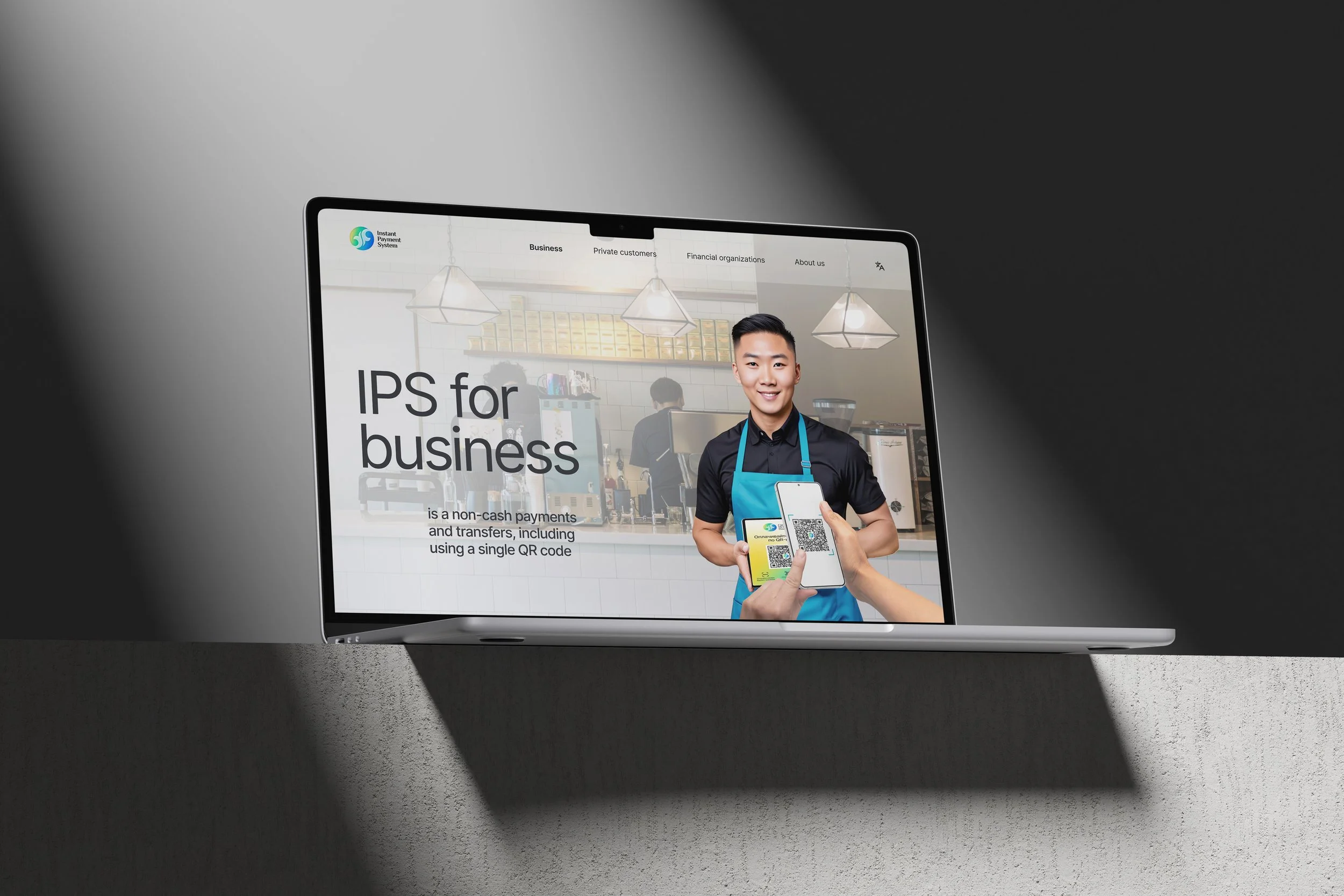
Website
Process
Our work on IPS website began by planning a clear structure that addresses all key audiences: we built four pages: three dedicated to distinct user groups within the service and a comprehensive “About us” page featuring news updates, a presentation link, and a partner inquiry form. Next, we crafted multiple wireframe versions, focusing on user flows and content hierarchy, before aligning with the client to finalize the structure. With approval secured, we moved into UI design, translating the wireframes into a polished, visually cohesive interface that reflects the brand’s fresh vitality and reliability within a streamlined, user-centered interface.


Design system and guide

Result
We completed a full launch cycle for IPS: delivering the website, brandbook, UI‑kit, and extensive training. Earning high praise from the IPS project team, executive leadership, partners, and users. The product now possesses all necessary components for full operation: a cohesive visual identity, functional web platform and clear usage guidelines. As a result, brand recognition and user trust have grown significantly, partner referral conversions have improved, and the volume of money transfers via the service has surged. This successful rollout has laid a solid foundation for ongoing scaling, and IPS continues to expand with new interface developments and marketing campaigns, reinforcing its position in Kazakhstan’s fast‑growing digital payments ecosystem.